NO, THEY ARE NOT! They are darn hard work and most fail because they aren’t simple, distinctive, clear and magical – the logo golden rules.
A logo is a signature used first to identify, then to support the brand promise and values. Alone, a logo doesn’t sell, but together, as part of a cohesive story, a logo makes an indelible impression and captures imagination.
POWERFUL LOGOS ALL SHARE THESE VALUES
Simple – This doesn’t mean boring. It means just enough to convey and not a single extra element.
Distinctive – Don’t blend into the sea of unimaginative, generic logos that stick together. Jump. Be bold.
Clear – Remember a logo is used to identify. Your logo must speak in a way your audience understands.
Wow – We call this magic (or pixie dust, if you prefer). It’s the pause, the skipped breath, that ‘thing’ that makes a logo timeless.
ELEMENTS OF A LOGO
(THAT ALL MUST WORK TOGETHER, TELLING THE SAME STORY)
Graphic – Symbol, pattern or shape (but you don’t always need this element).
Typeface – The style of type (font). Do you want strength or do you want whimsy? Do you want thought provoking or trustworthy? The right font works hard, but without you knowing.
Colour – Often the emotional part and deeply personal. It should support your brand story and all visual elements. There is a science behind colour strategy and behaviour. Contact MadLegs Media to learn how.
How do you achieve the ‘wow’? Let’s start with the basics.
THIS BLOG HIGHLIGHTS STEP ONE: THE CREATIVE BRIEF.
Following blogs will highlight the creation, evolution and implementation of your logo.
It starts with the brief (assuming you already have the name, know your audience and understand the competitive landscape). A solid creative brief is like gold, saving hours and days of misdirect, uncovering potential threats and opportunities, and focussing attention on the brand promise. Treat this step preciously.
If you want to see samples of past creative briefs, please send an email to rebecca@madlegsmedia.com. We are happy to share with curious minds.
Our briefs always include visuals – lots of visuals. Words are personal and not all of us speak the same language as a creative genius. Your idea of bold is different than mine. You may think you want something soft and romantic, but are really drawn to strength and certainty. Showing logo samples is a way of understanding preferences and the emotional element of a brand.
Below are some of my favourite logos that often end up in the creative brief.
LOGO SAMPLES*
*please note these logos are not the work of MadLegs Media. These are logos we love and designers we admire.
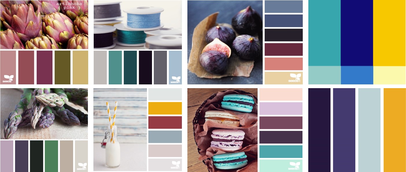
COLOUR SAMPLES*
Choosing the right colour palette helps set the tone of your brand and is one element in determining your brand identity.
* some palettes are ours, most are Design Seed.
IDENTITY SAMPLES*
It is often challenging to visualise how your colour pallete relates to your logo, business card, website, proposals and other items your business needs, so we include visuals. Yes, back to visuals because tangibles are much easier to understand.
*please note these samples are not the work of MadLegs Media. We owe thanks to brilliant designers and Pinterest for inspiration.
FINAL THOUGHTS
Where we end in the process is always different than where we started. I suggest you make no assumptions and be prepared and open for new ideas. It's a fun process. Enjoy.
“One must still have chaos in oneself to be able to give birth to a dancing star.”


